
Sunday, March 20, 2011
Stuff I like: Snapsort (WITH PICTURES)
This is a wall of text. In short, check out [ http://snapsort.com/ ] for any and all questions camera-related. They've got more information on digital cameras than you could shake a tree at.
As for the why in "Why should I look at snapsort?", read on:
I'm sure I've blathered about this a bunch to my friends and family, but I've really, really wanted to get a new camera for awhile now. The most recent and up-to-date photograph-snapping device I possess is an old film-based camera that you would take to a pharmacy or grocery store to have developed.
I was pointed to [ http://www.keh.com/ ], which seems to be one of the most painless ways to source cameras (used, sure- but they're up-front about everything).
Having conquered the WHERE CAN I BUY THIS dilemma, the next problem I had to tackle was WHAT DO I BUY. Cue the discovery of [ http://snapsort.com/ ], which is arguably one of the most comprehensive resources that accumulates, compiles, and shares relevant information about the specifications from camera-to-camera.
The site covers every camera I'd thought of purchasing, offering a service that compares the two devices and weighing their specs against one another.
They even have a "Just tell me what to buy" function on the front page- you input your budget and target device, and you'll receive a simple, straightforward THIS IS WHAT YOU SHOULD BUY response.
If that isn't enough to persuade you to check out their site, there's even more functionality after a recent update.
You can find user-contributed videos covering what a camera does, how well it performs, and how to use features spanning the everyday to the eclectic. Kinda like YouTube, but more relevant, helpful, and camera-related.
In a nod to the userbase of their site, they've also included a nifty voting system, allowing for community-based feedback about the characteristics of a particular camera.
There's a lot more functionality on their site than my typed words can properly vindicate, to be frank. If you're interested in purchasing a digital camera, they're a go-to resource.
There are also a few things that I think they could improve on, elucidated below:
While the design is "clean", the layout could use work. I'm something of a design snob and insist that layouts be just as professional and clean-cut as their design. The implementation of social-media interfaces (including facebook and twitter feeds) is admirably supportive of the current internet trends, but leaves much to be desired. On several pages, the feeds detract from the content available and have also caused delays in page-loading when I was using a slower internet connection. This was most noticeable for me except when loading the blog - the design snob in me thinks that the feeds would look cleaner if they remained in sidebars.
The colors used by the site are acceptable in terms of form, but less so in function- the schemes used are very bright whites and low-contrast colors. The grayscale used for most of the site contributes to the professional image of the site (wordplay intended), but also causes some difficulty-of-reading, noticeable on the left sidebar.
While the feature was probably implemented with good intent, the pseudo-pop-up functionality of the "Learn More" button on most items that weren't immediately self-explanatory was a bit jarring when it required an extra click to remove the splash from the page. In lieu of what is arguably a helpful (but somewhat unstreamlined) resource, I might recommend something more like alt-text used for images.
Given my utilitarian views on internet sources (and basic knowledge of most subjects covered), it might also be worth retaining for the end-users who would prefer a distinctly-outlined and simply-explained tidbit of related information.
Also related is the graphic used for the "Learn More" icon - depending on the color of the background it's against, it will occasionally display an unsightly border upon mouseover. It's nothing terrible, just something that I find somewhat off-putting.
In short:
I think that the design is clean but could use some work insofar as color choices are concerned. Layout of pages should be reworked to reduce total number of "columns", and/or integrate components in a less intrusive fashion.
As for the why in "Why should I look at snapsort?", read on:
I'm sure I've blathered about this a bunch to my friends and family, but I've really, really wanted to get a new camera for awhile now. The most recent and up-to-date photograph-snapping device I possess is an old film-based camera that you would take to a pharmacy or grocery store to have developed.
I was pointed to [ http://www.keh.com/ ], which seems to be one of the most painless ways to source cameras (used, sure- but they're up-front about everything).
Having conquered the WHERE CAN I BUY THIS dilemma, the next problem I had to tackle was WHAT DO I BUY. Cue the discovery of [ http://snapsort.com/ ], which is arguably one of the most comprehensive resources that accumulates, compiles, and shares relevant information about the specifications from camera-to-camera.
The site covers every camera I'd thought of purchasing, offering a service that compares the two devices and weighing their specs against one another.
 |
| It even has auto-fill support for camera names! |
They even have a "Just tell me what to buy" function on the front page- you input your budget and target device, and you'll receive a simple, straightforward THIS IS WHAT YOU SHOULD BUY response.
 |
| Like Bing! for cameras. |
If that isn't enough to persuade you to check out their site, there's even more functionality after a recent update.
You can find user-contributed videos covering what a camera does, how well it performs, and how to use features spanning the everyday to the eclectic. Kinda like YouTube, but more relevant, helpful, and camera-related.
In a nod to the userbase of their site, they've also included a nifty voting system, allowing for community-based feedback about the characteristics of a particular camera.
There's a lot more functionality on their site than my typed words can properly vindicate, to be frank. If you're interested in purchasing a digital camera, they're a go-to resource.
There are also a few things that I think they could improve on, elucidated below:
While the design is "clean", the layout could use work. I'm something of a design snob and insist that layouts be just as professional and clean-cut as their design. The implementation of social-media interfaces (including facebook and twitter feeds) is admirably supportive of the current internet trends, but leaves much to be desired. On several pages, the feeds detract from the content available and have also caused delays in page-loading when I was using a slower internet connection. This was most noticeable for me except when loading the blog - the design snob in me thinks that the feeds would look cleaner if they remained in sidebars.
The colors used by the site are acceptable in terms of form, but less so in function- the schemes used are very bright whites and low-contrast colors. The grayscale used for most of the site contributes to the professional image of the site (wordplay intended), but also causes some difficulty-of-reading, noticeable on the left sidebar.
While the feature was probably implemented with good intent, the pseudo-pop-up functionality of the "Learn More" button on most items that weren't immediately self-explanatory was a bit jarring when it required an extra click to remove the splash from the page. In lieu of what is arguably a helpful (but somewhat unstreamlined) resource, I might recommend something more like alt-text used for images.
Given my utilitarian views on internet sources (and basic knowledge of most subjects covered), it might also be worth retaining for the end-users who would prefer a distinctly-outlined and simply-explained tidbit of related information.
Also related is the graphic used for the "Learn More" icon - depending on the color of the background it's against, it will occasionally display an unsightly border upon mouseover. It's nothing terrible, just something that I find somewhat off-putting.
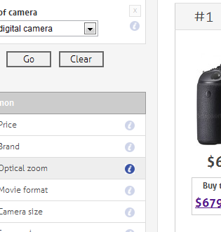 |
| The highlighted (i) usually looks fine on a white background. |
In short:
I think that the design is clean but could use some work insofar as color choices are concerned. Layout of pages should be reworked to reduce total number of "columns", and/or integrate components in a less intrusive fashion.
Subscribe to:
Post Comments (Atom)
Wow, thanks for the site. I'm looking at getting a dslr soon, this will be very helpful.
ReplyDeletewow that will definitely help everyone buying on a budget
ReplyDeleteThanks for sharing this
ReplyDeletethank you for this amazing tip!
ReplyDeleteill have to check this out
ReplyDeletewow I just go to ebay for this stuff. never again lol
ReplyDeleteThanks for sharing this. I will have to check this out, as I have been thinking of getting a new camera :D.
ReplyDeletethat is awesome info, thanks
ReplyDelete